Modern Website Design: Latest Trends in Web Design [2020]
![Modern Website Design: Latest Trends in Web Design [2020]](http://f1.biznet-us.com/u_dirs/417/417343/p/fb0c66a33ff3b243f8c4e5e7480bc2a6.jpg)
A website, the first impression of your business, is one of the best advocates of your business, promoting it 24/7 – reflecting credibility and brand recognition. To create a long-lasting and appealing impression, a delightful Website Design can prove to be the ultimate solution. Bad website design can restrain your lead conversion and brand reach, as a customer never returns to a website with improper and badly organized content as well as lackluster performance. A study claims that 94% of the users visiting a website are mostly influenced by the design of the website, making it a deciding factor in the lead conversion.
Website designs are continually evolving and so are the Company’s choices for their websites. Looking into the significance of Website Design into the business, the companies are opting for different designing trends, some are rehashing the past styles and some are interminably trying different things and using modern website designs..
Modern Website Designs Trends in 2020
Perfect and innovative placement of the content, that accurately targets the customer’s needs and grabs their attention, teamed up with the effortless operation that offers a fluid experience, is something that a website should aim at. To create differentiation with the competitors and look updated, the companies are revamping their website with various creative elements and ideas. Let’s dig a little deeper and check out some emerging Website Designing Trends that are going to rule in 2020.
2D and 3D Motion Graphics
As we know, we eat with our eyes first. Motion graphics, an incredible and ingenious way of portraying the business idea, is definitely going to be the choice of many companies and users in 2020. The website can include the elements like 2D and 3D animations and video, to convey their message and services in the form of short stories, 2D and 3D videos, animated pictures, GIFs, etc. These elements not only make the websites more interactive and easily comprehensible, but also saves a lot of time spent on the research and perusing.
Companies are experimenting with their logos, transforming the 2D logo picture into the informative logo animation, which not only attracts the customer but also shouts about their services as well. 2D and 3D animated posters are also trending from past few years and will continue to do so in the coming years as well.
Parallax website design
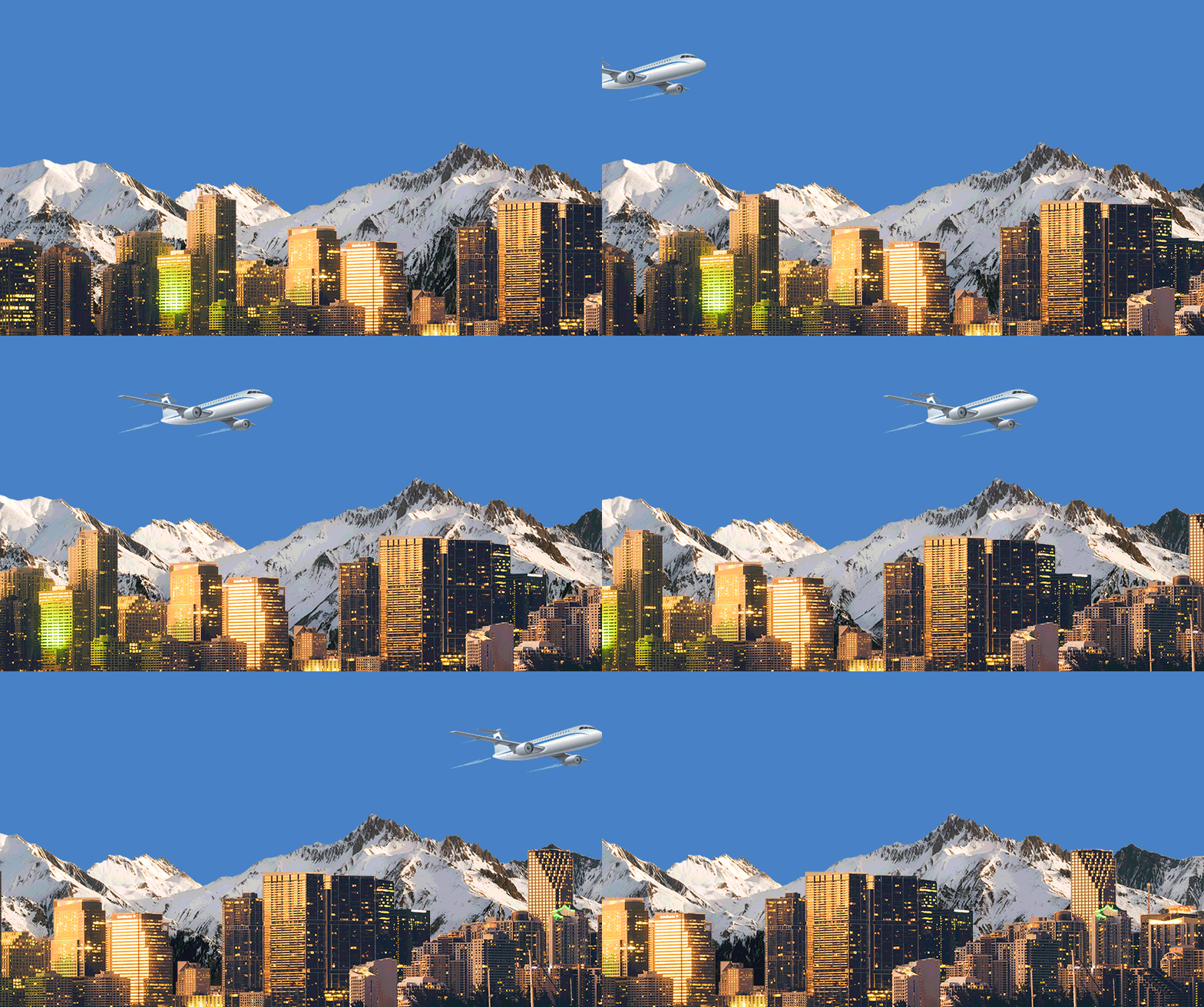
Parallax website design works on the idea of Parallax Scrolling, i.e. background and foreground content moving in parallel, however at a different pace and conveying a different story. This design presents a broader picture of your business idea and appears more like a 2D view, introducing various verticals of the business at the single scroll down.
A strategic choice of the background and foreground content can result in a highly intuitive and dynamic website. Many websites like British Legion, Kontainer, Hitachi, etc, have already incorporated the Parallax scrolling into their website, few playing with the typographies at the foreground along with the background image, few are using animations, etc.
Overlapping layer Website
Overlapping layer website design is one of the most unique and modern website designing techniques, including two layers on the same page, making it more attractive as well as interactive to the users. In this technique, the overlapping layer pops out of the background content, empowering you to grab the user’s attention on the message such as discounts, offers, ideas, etc. that you want to convey.
You can place various types of elements on the overlapping layer as per your choice i.e. the one which goes with your business idea such as floating text, card, image, etc. For Example, World Champion Amsterdam uses its title on the overlapping layer. Tactical use of the spaces can target the right user and direct them at the right place, beneficial for both the user as well as the business.
Minimal Design Website with White Spaces
Minimal Website Design, which holds its root in the 20th century, is coming back to the trend in 2020, however in a better version. This is a technique of integrating Strategic Simplicity within the UI of the website. Minimal Design does not mean the expulsion of the element from the UI, rather picking the most essential elements and placing each of them smartly.
The shrouded weapon behind the Minimal design website is the White Spaces or the Negative Spaces. The strategic use of the white spaces along with the content on the website drives more focus towards the content of the website. Some of the websites like Harvard Museum, Medium, etc. give some major designing goals using negative spaces.
Dark Mode
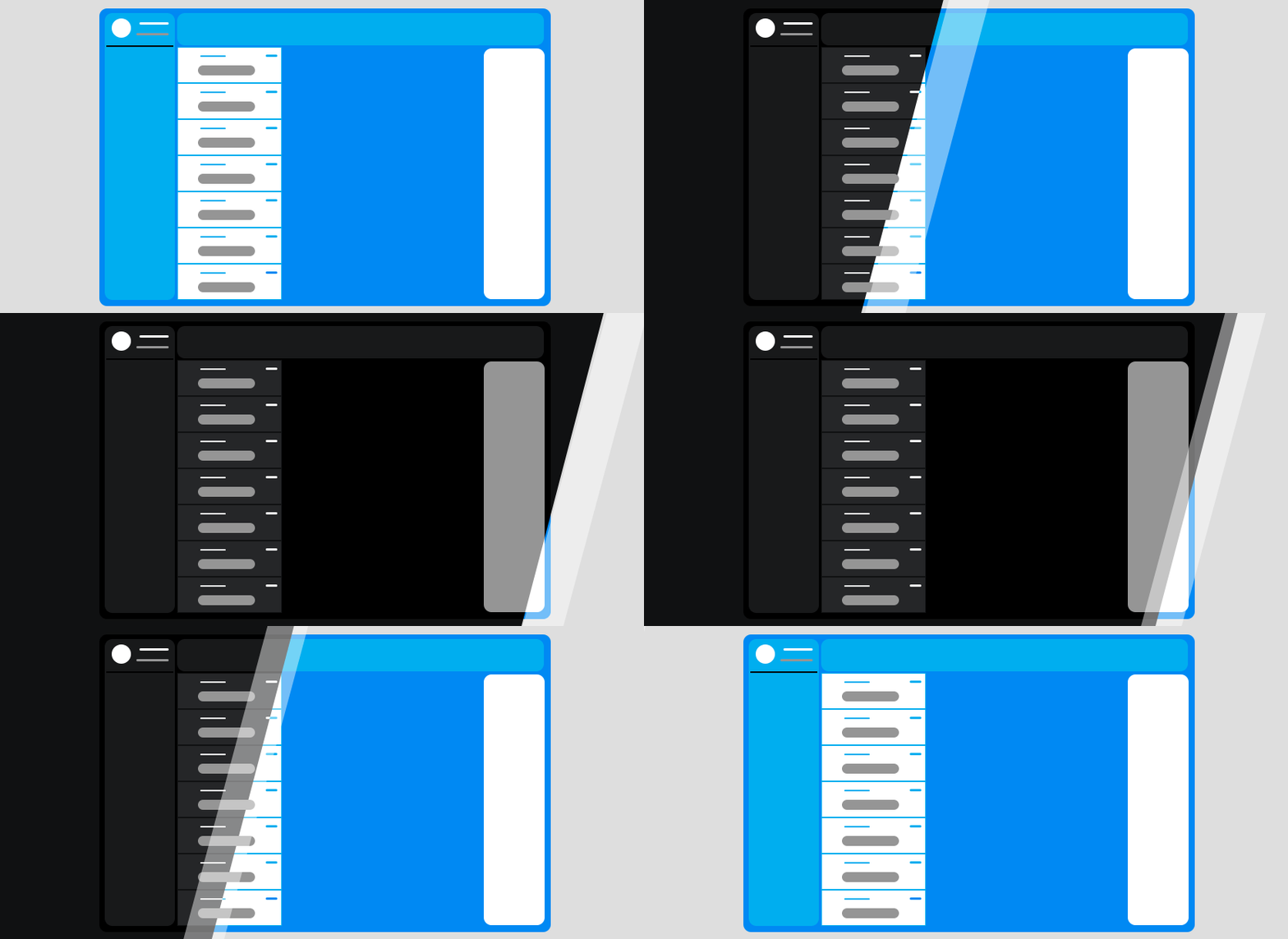
Dark Mode ends up being exceptionally advantageous for both the website designing as well as the device configuration perspective. Being placed in the dark mode the elements of the websites pop out in a more clear and sound way. Also, the mode works great for the OLED(Organic Light Emitting Diode) screen, saving the power as well as expanding the screen life expectancy.
Illustrations on the User Interface
Illustrations are the creative artwork that adds uniqueness and originality to the websites. Illustrations are the pictorial rendition of the idea such as sketch, paintings, designs, etc., which depicts a story, making it easier to connect and comprehend. The illustrations can be used in multiple ways such as the animated illustration, the illustrations paired up with the real pictures, etc.


